2026.2.27
素もの Vol.01 古屋 絵菜
SU — Things in Their Pure State Vol.01 Ena Furuya
この冊子のタイトルにもなっている〝素〟という言葉があらわす意味は、単純なようで奥深い。素朴でもあり、素直でもある。わたしたちが共感する〝素〟なものは、自然と身近に集まってくる。そんな心惹かれる〝素〟なものたちを紹介します。
The word “So” (素), which gives this booklet its title, may seem simple at first glance, yet it carries a deep and layered meaning.
It suggests something unpretentious, honest, and true to itself.
The things we feel drawn to as “so” naturally gather close to us, without force.
In this booklet, we introduce such quietly compelling “so” things.
Vol.01 古屋 絵菜
Ena Furuya
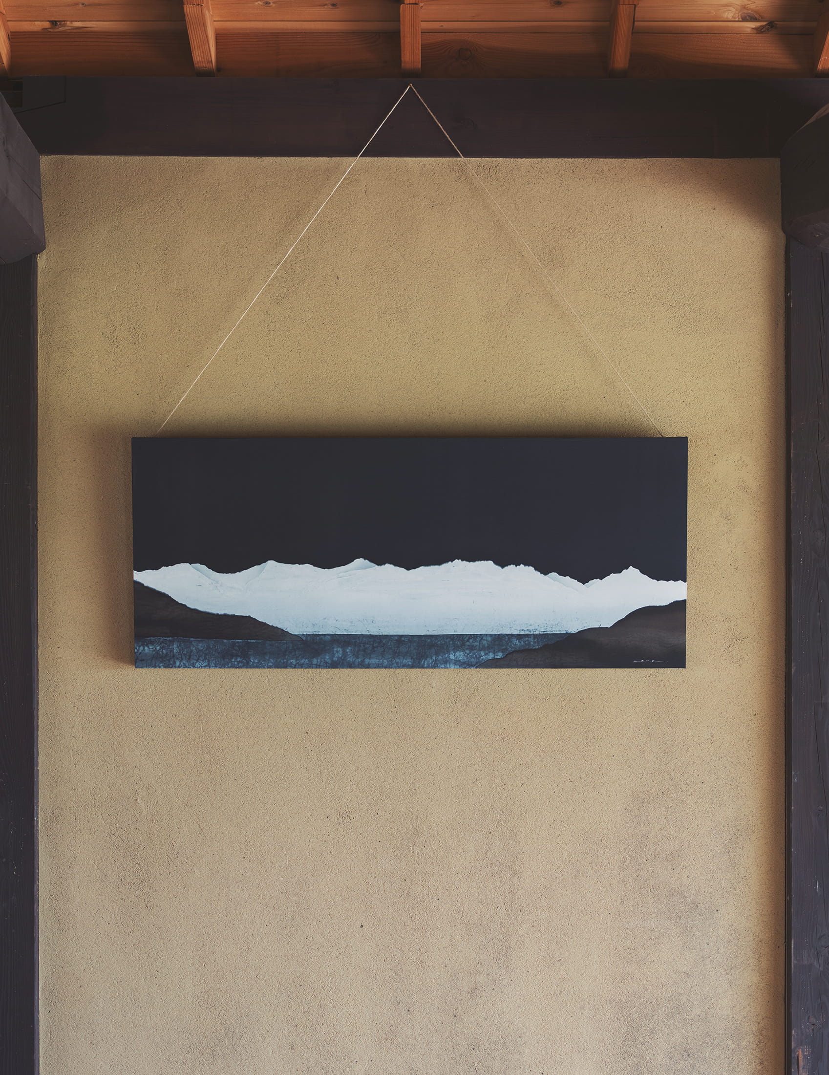
「 山山. 」sansan.
(農鳥岳—甲斐駒ヶ岳 )
素材/絹 臈纈染め w1200 × h500 × d40 mm
“SANSAN.”
(Nōtori-dake – Kai-Komagatake)
Material: Silk
Technique: Roketsu-zome (wax-resist dyeing)
Size: w1200 × h500 × d40 mm
素朴屋のオフィスに飾られた古屋さんの臈纈染めの作品は、甲州市から望む南アルプス連峰を描いたもの。漆黒の空に白く浮かび上がる山並みは、その雄大さと高貴な姿で人々の暮らしを見守るように囲み、一つとなって崇高に鎮座し、古来より畏敬を抱かせる存在でした。荘厳さと静謐さを湛え、その下に広がる青は人々が暮らす街の盆地を象徴しています。
両者は境界を持ちながらも切り離せず、影響し合う存在。この絵を見つめていると、その崇高さに改めて気づかせてくれます。山と人の営みが互いに響き合い、影響を与え合いながら存在していることを示しているからです。
固定された一枚の絵としての風景ではなく、観る人が自身の記憶や感情を重ねることで、その意味や表情が絶えず変化していきます。つまり個人の経験や、出会いで更新され続けるものであり、その瞬間ごとに新たな姿を現すのです。
Displayed in the SOBOKUYA office is a roketsu-zome (wax-resist dyeing) work by Ena Furuya, depicting the Southern Alps as seen from Koshu City.
The mountain range, glowing white against a pitch-black sky, surrounds the lives of people with both grandeur and dignity.
United as one, it sits solemnly and nobly, a presence that has inspired reverence since ancient times.
Filled with both majesty and stillness, the blue expanse spreading below symbolizes the basin where people live.
Though the mountains and the human world are divided by a boundary, they cannot be separated; they are mutually influential, deeply connected.
Gazing at this work reminds us once again of that quiet reverence — of how mountains and human life resonate with one another, existing in constant dialogue.
This is not a fixed landscape captured in a single image.
As viewers layer their own memories and emotions onto it, its meaning and expression continue to shift.
It is endlessly renewed through personal experience and encounters, revealing a new face in each moment.
素朴屋のロゴマーク
「そ」は古屋さんの手描き
素朴屋の新しいロゴを制作するにあたり、これからの海外での展開なども考え、モチーフにもなっていた「そ」の平仮名を古屋さんに手描きしてもらいました。あらゆる方向性を模索し、試し書きも含めると100以上の「そ」を書き、その中からたった一つの文字を選びました。まるで鳥が木に留まって休んでいるようにも見えるのは、選んでから気づいたことのひとつ。
The SOBOKUYA Logo
The character “so” (そ) in the SOBOKUYA logo was hand-drawn by Ena Furuya.
When creating SOBOKUYA’s new logo, we considered our future overseas expansion and asked Furuya to hand-draw the hiragana “so,” which had long served as our motif.
Exploring every possible direction, she wrote over a hundred variations before we selected just one.
Only afterward did we realize that it resembles a bird resting quietly on a branch.
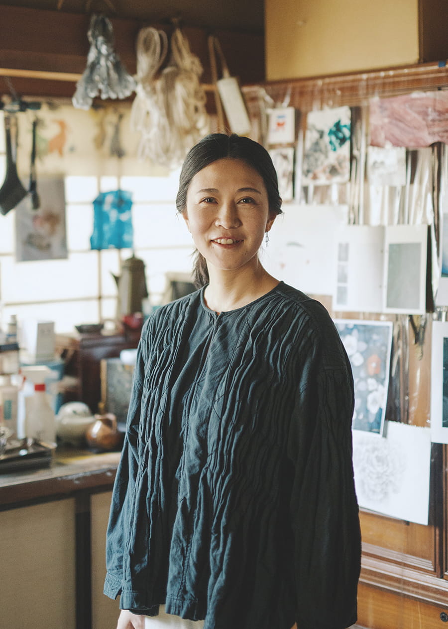
古屋絵奈
Ena Furuya
1985年、山梨県甲州市生まれ。武蔵野美術大学大学院出身。ろうけつ染めの染色家として活動し、甲州市の生家にアトリエを構える。NHK大河ドラマ『八重の桜』のオープニングタイトルバックに作品が採用、中国にて個展を開催するなど、国内外での評価が高く、その将来が嘱望されている芸術家のひとり。
Born in 1985 in Koshu City, Yamanashi Prefecture.
A graduate of Musashino Art University’s graduate program, Furuya is a roketsu-zome textile artist.
She maintains her studio in her family home in Koshu City.
Her work was featured in the opening title sequence of NHK’s historical drama Yae no Sakura, and she has held solo exhibitions in China.
Highly regarded both in Japan and abroad, she is considered one of the most promising artists of her generation.